Website Design Zaper.ai
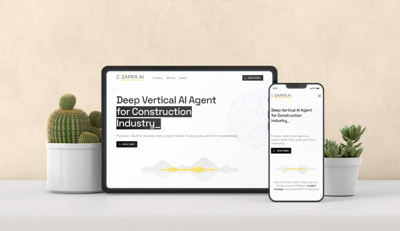
Increase in average session duration after launch
Demo sign-ups increased — quality leads generated directly from the site
Unique voice interaction demo — built to make AI tangible, not theoretical
Full UX phases completed — Empathise, Define, Ideate, Design, Test
AI that nobody could explain — including the website.
Zaper.ai had a powerful AI-driven workforce management platform — but a website that failed to communicate it. The construction industry users it was built for found the messaging too technical, the features too abstract, and the call to action too buried.
The challenge wasn’t branding. It was clarity. How do you take genuinely complex AI capabilities — voice recognition, automated reporting, biometric attendance — and turn them into a website that a site supervisor or facilities manager immediately understands and wants to try?
“The challenge was to simplify complex features, cater to diverse users with varying needs, and drive demo sign-ups — without dumbing down what the product actually does.”
Problem definition, stakeholder briefing
Construction, MEP (Mechanical, Electrical, Plumbing), and Facility Management — each with different vocabulary, pain points, and digital comfort levels.
Demo sign-ups for enterprise prospects and general enquiries for SME clients — each needed a different journey, both served from one site.
Empathise → Define → Ideate → Design → Test. Full research-backed design process, not a visual-first solution.
Five phases. Research first, visuals last.
I ran the full double-diamond design process — not because it’s standard, but because building a marketing website for a product most users don’t yet understand requires evidence, not assumptions.
User research and user interviews with construction, MEP, and facility management professionals to identify real pain points and mental models.
User personas and goal statements. Identified three distinct visitor types — each needing a different message but landing on the same site.
Brainstorming, card sorting, and user flow mapping. Explored how to structure the site so each visitor type finds their way to the right CTA.
Paper wireframes → visual design → interactive prototype. Every section validated against the original user research findings before moving forward.
Usability testing on low-fidelity wireframes, survey insights, and iterative improvements before final handoff.
What users actually expected from a B2B AI website.
I conducted user interviews, competitive analysis of similar platforms, and usability testing on low-fidelity wireframes. These five expectations consistently emerged across all three industry sectors.
Users expected a concise, jargon-free explanation of what Zaper AI does in the first 5 seconds of landing. Technical language without context caused immediate drop-off.
Real-world examples of AI applications and their measured impact were highly valued — users couldn’t assess relevance without seeing the product in a context similar to their own.
Users strongly preferred interactive product demos or embedded videos over static screenshots. Experiencing the product — even briefly — dramatically increased trust and time on page.
Intuitive layout with fast access to features, pricing, and contact. On-site professionals often browsed on mobile between tasks — navigation had to work in 30-second visits.
Mobile-first access was non-negotiable. Construction site professionals discovered the site on their phones — a desktop-only experience would have lost the majority of the target audience.
Enterprise buyers needed to see data security commitments, company credibility, and team information before they’d consider booking a demo or sharing contact details.
The Voice Interaction Demo — turning abstract AI into something you can feel.
The standard B2B SaaS approach is to describe the product. I made users experience it. Right below the hero section, I introduced a live voice interaction demo that let any visitor feel Zaper’s core capability firsthand — no account, no onboarding, no friction.
A live AI-powered microphone experience embedded directly in the marketing website — turning abstract capability claims into a 30-second personal demonstration. This became the highest-engagement element on the page.
The decisions that turned a complex product into a clear website.
Each of these pivots came directly from user research or usability testing — not preference, not trend-following.
Feature-led hero: “AI-Powered Attendance, Workforce Management, and Voice Reporting” — a list of capabilities.
“Deep Vertical AI Agent for Construction” — a single positioning statement that speaks to industry identity, not feature inventory. Research showed construction professionals responded to specificity about their industry, not generic AI language. The headline became the clearest differentiator from competitors.
Embedded product screenshots with caption text explaining features — standard B2B SaaS approach.
Interactive voice demo that lets visitors actually experience the core AI capability. Usability testing showed screenshots produced low recall — users couldn’t articulate what the product did even after reading the captions. Live interaction produced immediate understanding and dramatically increased demo sign-up intent.
A full navigation menu with dropdowns for Features, Pricing, Industries, Resources, Company — maximising content access.
Streamlined to five core sections with a persistent “Book Demo” CTA always visible. Card sorting revealed users found deep navigation confusing — they wanted to reach product information in one click, not two. Simplifying the nav increased CTA visibility and reduced bounce from the top of the page.
One generic page flow for all visitors — same content sequence for everyone.
Goal-driven flows designed for three distinct visitor types: enterprise decision-makers (directed towards demo booking), operations teams (directed toward feature detail), and technical evaluators (directed toward integrations and security). Each arrived at their relevant CTA naturally through content hierarchy, not forced redirection.
Desktop-first design adapted for mobile — a standard responsive breakpoint approach.
Mobile-first design from the first wireframe. Research confirmed that construction site professionals discovered and browsed the site primarily on phones — often between tasks with limited time. Every section had to work as a standalone 30-second experience before being extended for desktop.
Desktop and mobile. Every decision visible in the live product.
These are the shipped screens. Each design decision from the journey above is visible here — from the industry-specific headline to the voice waveform demo to the persistent Book Demo CTA.
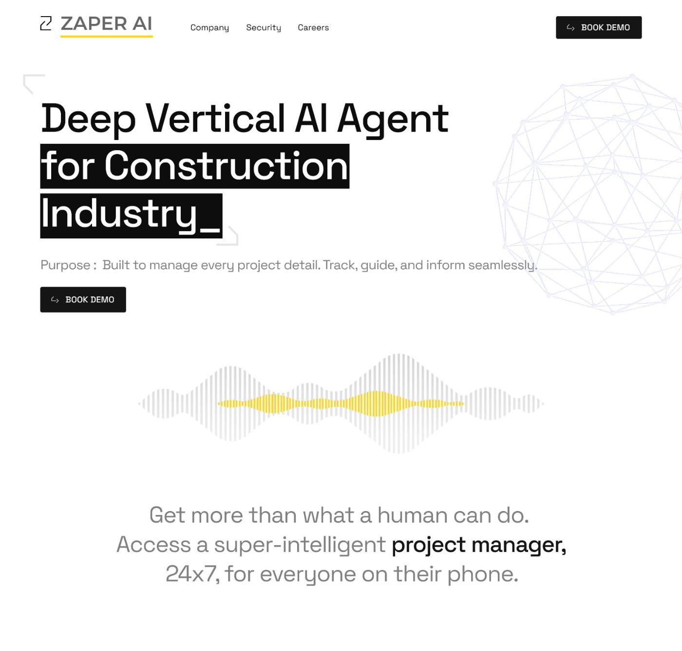
The headline “Deep Vertical AI Agent for Construction Industry” uses a dark background highlight on the key phrase — making it impossible to miss the industry specificity that research showed was the #1 factor in converting construction professionals.
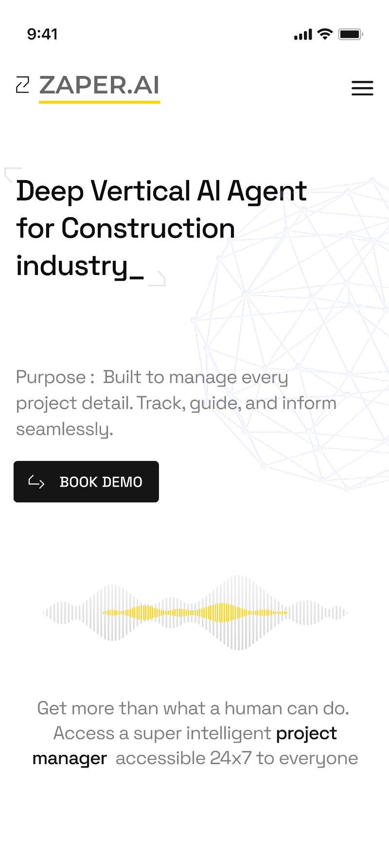
The mobile hero delivers headline, purpose, CTA, voice demo, and a value proposition statement within a single scroll. Designed mobile-first — construction site professionals browse on their phones between tasks.
A business-ready website that converts curiosity into demos.
The final site balances simplicity, performance, and persuasion — designed so that any visitor type understands the product and knows exactly what to do next, within 60 seconds of landing.
Designed so that a visitor who only sees the hero still understands the product — and a visitor who reads every section arrives at the CTA already convinced.
- Clear value messaging“Deep Vertical AI Agent for Construction” — industry-specific positioning, not generic AI language
- Interactive voice demoLive AI capability demonstration below the hero — users experience the product before reading about it
- Interactive walkthroughsEmbedded demos and animations let users explore AI capabilities at their own pace
- Streamlined navigationFive-section menu — Home, Safety & Security, About, Blogs, Book Demo — always accessible
- Mobile-first designEvery section built for 30-second phone browsing before being extended for desktop
Every design decision traces back to one business goal: qualified demo sign-ups. The site doesn’t just inform — it converts.
- Persistent Book Demo CTAAlways visible in navigation — zero friction between decision and action
- Optimised user journeysGoal-driven flows for enterprise buyers, operations teams, and technical evaluators — each pathway leads to the right CTA
- Trust signals throughoutSafety & Security section, About Company, and team content address enterprise buyer concerns before they surface
- Blog & thought leadershipRegular content builds authority and drives returning organic traffic from industry searches
- 40% session duration increaseThe live demo became the highest-engagement element — users stayed to explore, not just read
Five sections. Each one earns its place in the nav.
Card sorting revealed that users wanted fast access to three things: what the product does, whether the company is trustworthy, and how to try it. The final five-section structure maps directly to those three needs.
Overview of Zaper.ai’s AI-driven workforce management capabilities. Designed to communicate the core value proposition within the first viewport — before any scrolling.
Data protection measures, compliance standards, and transparency about how workforce data is handled. Positioned early — research showed enterprise buyers checked this before any other section.
Vision, mission, and team story. Addresses the credibility gap that all AI-first companies face — buyers need to trust the team, not just the technology.
Industry insights, product updates, and AI workforce articles. Builds organic search authority and gives returning visitors a reason to come back between evaluation stages.
A persistent call-to-action throughout the site. Clicking it from anywhere leads to a streamlined demo-booking flow — no forms that ask for information the sales team doesn’t need.
If a section didn’t build credibility or drive a demo sign-up, it didn’t make the final navigation. This principle cut the initial 8-section structure down to five without losing any critical content.
Three visitor types. One site. Three clear paths.
Industry-specific headline sets context in under 3 seconds. All visitor types start here.
Visitor interacts with live AI demo — converts abstract claims into personal experience.
Relevant content for each visitor type — operations, enterprise, or technical evaluator.
Enterprise buyers check credentials. Team and compliance content addresses objections.
Persistent CTA available from any point. No re-navigation needed to take action.
The hard design problems.
Construction industry professionals are pragmatic, not tech-forward. Describing AI capabilities in text produced low comprehension and zero emotional connection to the product.
The live voice interaction demo — visitors experience the AI summarising their own words in real time. This turned a conceptual claim into a personal proof point in under 30 seconds, producing the highest demo sign-up intent of any element on the page.
Enterprise buyers, operations managers, and technical evaluators all landed on the same homepage — but each needed different information to move forward. Generic messaging served none of them well.
Designed goal-driven content flows mapped to each visitor type. Content hierarchy — not separate pages — guided each persona toward their relevant CTA naturally. User testing validated that all three types found their path without confusion.
Construction is one of the least digitised industries. AI-powered workforce tools face a trust gap that tech-first industries don’t — users are sceptical, not curious.
Embedded trust signals throughout — not just in a dedicated “Security” section. Social proof, team transparency, compliance language, and industry-specific use cases appeared across every scroll depth, so credibility built progressively rather than being asked for upfront.
B2B SaaS websites often rely on aggressive pop-ups, gated content, and forced form fills. Research showed construction professionals actively avoided these — and closed the tab.
Made the demo CTA persistent and low-friction — always visible, never intrusive. Removed all gated content barriers before the booking form. Users who reached the Book Demo page had already self-qualified through the content journey, resulting in higher-quality leads with less friction.
Results after launch.
Increase in average session duration — driven by the live voice demo
Demo sign-ups — quality leads generated directly from the website experience
Live AI interaction embedded in a marketing site — a first for the product
Distinct visitor journeys designed — enterprise, operations, and technical evaluators
Navigation sections — down from an initial 8, without losing any critical content
Bounce rate reduced — users stayed longer and explored deeper after the demo interaction
What this project taught me.
The voice demo generated more comprehension in 30 seconds than any copy I could have written. For complex or unfamiliar technology, the most powerful page element is one that eliminates the need to explain.
“Deep Vertical AI Agent for Construction” outperformed every generic AI headline we tested. Knowing your audience well enough to name their industry in the hero is not a marketing decision — it’s a UX decision that affects every conversion metric downstream.
Reducing from 8 sections to 5 felt like losing content. It was actually gaining clarity. The best navigation is the one that makes every decision obvious — not the one that covers every possible option.