Driver Daily Route Timeline
Significant drop in coordination calls between drivers and dispatchers
Single tap to understand the full day — every job, every staff status
Driver retention improved — reported stress levels dropped noticeably
Paperwork required to fix a check-in mistake — one-tap Undo handles it
Nobody knew who was actually in the vehicle.
On the surface, the ask was simple: "show routes in an app." But the real problem ran deeper. Drivers didn't know who was actually in the vehicle, when the next job started, or how long they had before they needed to leave. Dispatchers were equally blind.
The result was a constant loop of phone calls, WhatsApp messages, missed pickups, and idle time. Drivers were managing routes across three different channels simultaneously — while driving. That's not a productivity problem. That's a safety problem.
"The deeper problem was uncertainty and friction — drivers didn't know who was actually in the vehicle, when the next job starts, or how long until they must leave."
Problem framing from field observation sessions
Phone calls, WhatsApp groups, and a basic job list app — none of them showing a shared, real-time view of who's in the car.
Drivers needed glanceable, one-tap simplicity. Dispatchers needed accurate status visibility and route verification. One product had to serve both.
Missed pickups, wrong staff check-ins, no buffer time visibility, and no way to undo a mistake without calling dispatch.
Three principles for an interface used while driving.
Show the whole day in one view. A driver pulling up to a stop needs to understand their next three hours in under 2 seconds — before they open the car door.
Large touch targets and one-tap actions only. No multi-step confirmations, no navigation to a second screen to complete a core task. If it takes more than one tap, it's too slow.
Mistakes happen on the road. Every action — check-in, drop-off, pick-up — must be undoable in one tap without calling dispatch, filling a form, or losing any data.
A colour system drivers read without thinking.
Every screen element had to be interpretable at a glance. I built a four-state badge system that drivers learn in the first 60 seconds and never have to re-learn.
The pivotal decisions that shaped the final product.
These weren't just visual choices — each one came from a real finding in field observation or usability testing that forced a rethink.
A list view showing jobs sorted by time, similar to a calendar app. Clean, familiar, standard.
A timeline-centred view where each job is a large card with location map, time window, staff list, and two primary CTA buttons visible without scrolling. Field testing showed that list views forced drivers to mentally reconstruct the day — the timeline made the whole day instantly readable as a sequence.
Staff status shown only inside individual job cards — tap the job to see who's in the vehicle.
A persistent "Staffs in my car (N)" button always visible on the main timeline, opening a roster modal with Check-in, Undo, Drop-off, and Pick-up actions. Research showed the most common driver anxiety was not knowing their current passenger count — making it persistent removed that anxiety entirely.
Inline check-in within the job card, small tap target, adjacent to other buttons.
Large full-width green Check-in button as the primary CTA. Red Undo button immediately accessible. Button size was driven by the use context — drivers are often in motion, glancing at the screen for under 3 seconds. Small targets caused mis-taps that required calling dispatch to correct.
No time buffer display — drivers could see job start times but had to mentally calculate travel time themselves.
Live countdown between jobs: "30 mins to start next job." This single element reduced late departures significantly in testing — drivers stopped relying on memory and gut instinct for departure timing and trusted the visible countdown instead.
Wrong check-ins required contacting dispatch to manually correct — treated as an exception, not part of the main flow.
One-tap Undo built into every action as a first-class feature, not an afterthought. Drivers in testing described the Undo button as "the most important thing in the app" — knowing they could correct a mistake instantly made them more confident using the app at all.
Staff contact details shown as plain text — drivers would copy-paste numbers manually to call or message.
Quick-contact buttons (Call, WhatsApp) embedded directly in the staff modal, one tap from the timeline. This eliminated the copy-paste friction that was causing drivers to use the wrong channels and miss time-sensitive communication during pickups.
A timeline that gives drivers and dispatchers one shared truth.
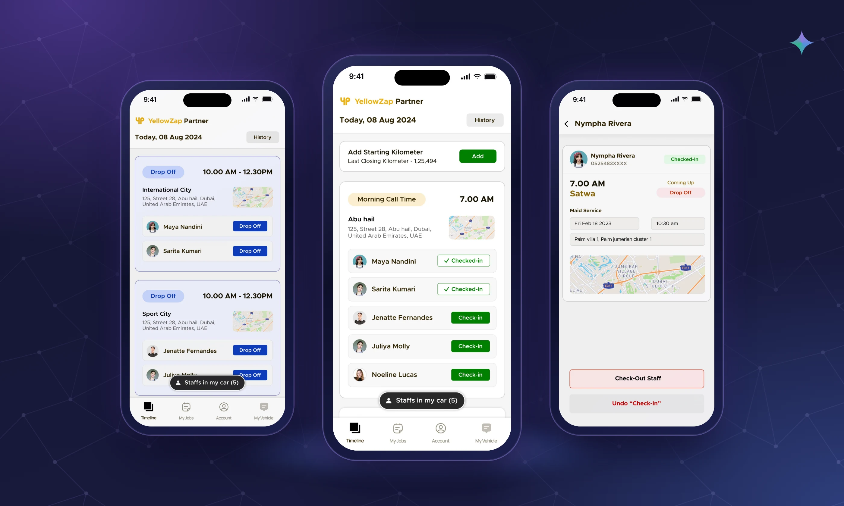
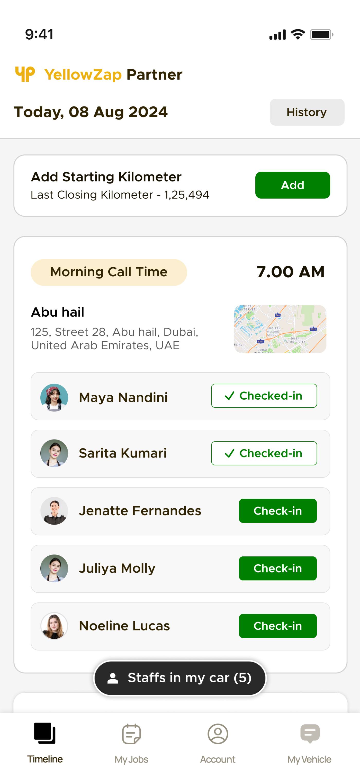
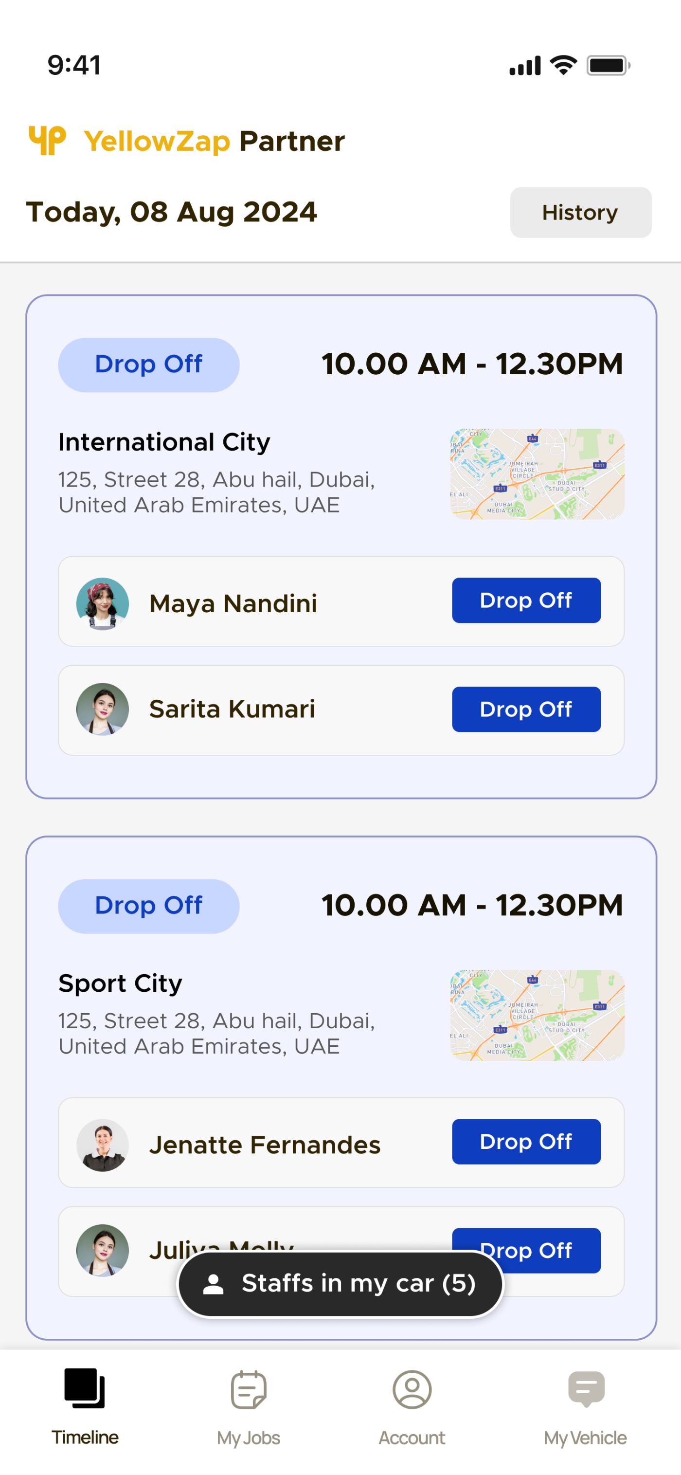
The shipped concept is a timeline-centred mobile app where each job is a large card showing the job window, location map, and staff list with real-time status badges — all visible without a single tap.
The full day in one scroll
Designed for quick glances between stops. Every piece of information a driver needs is surfaced at the card level — nothing buried in sub-screens.
Location, time window, and two primary CTAs (Pick Up / Drop Off) visible on every card
"Staffs in my car (N)" always visible — opens roster modal with all quick actions
"30 mins to start next job" — visual buffer cues prevent late departures
Every check-in, drop-off, and pick-up is instantly reversible — no dispatch call needed
Call or WhatsApp any staff member in one tap from the staff modal
Full route visibility, no follow-up calls
Dispatchers see real-time staff status and route progress without needing to contact the driver directly.
Green / yellow / gray / red — status of every staff member visible at a glance across all jobs
Start-km input and history lets managers verify routes and approve payments accurately
Full route history with timestamps — used for route verification and driver payment
Dedicated view for vehicle-level status, separate from job-level timeline
No more guessing who's in which vehicle — check-in states visible in real time
Three screens. Every design decision visible.
These are the three core screens of the product. Each one maps directly to a design decision made in response to a specific field finding.
Every key action for one staff member, one screen
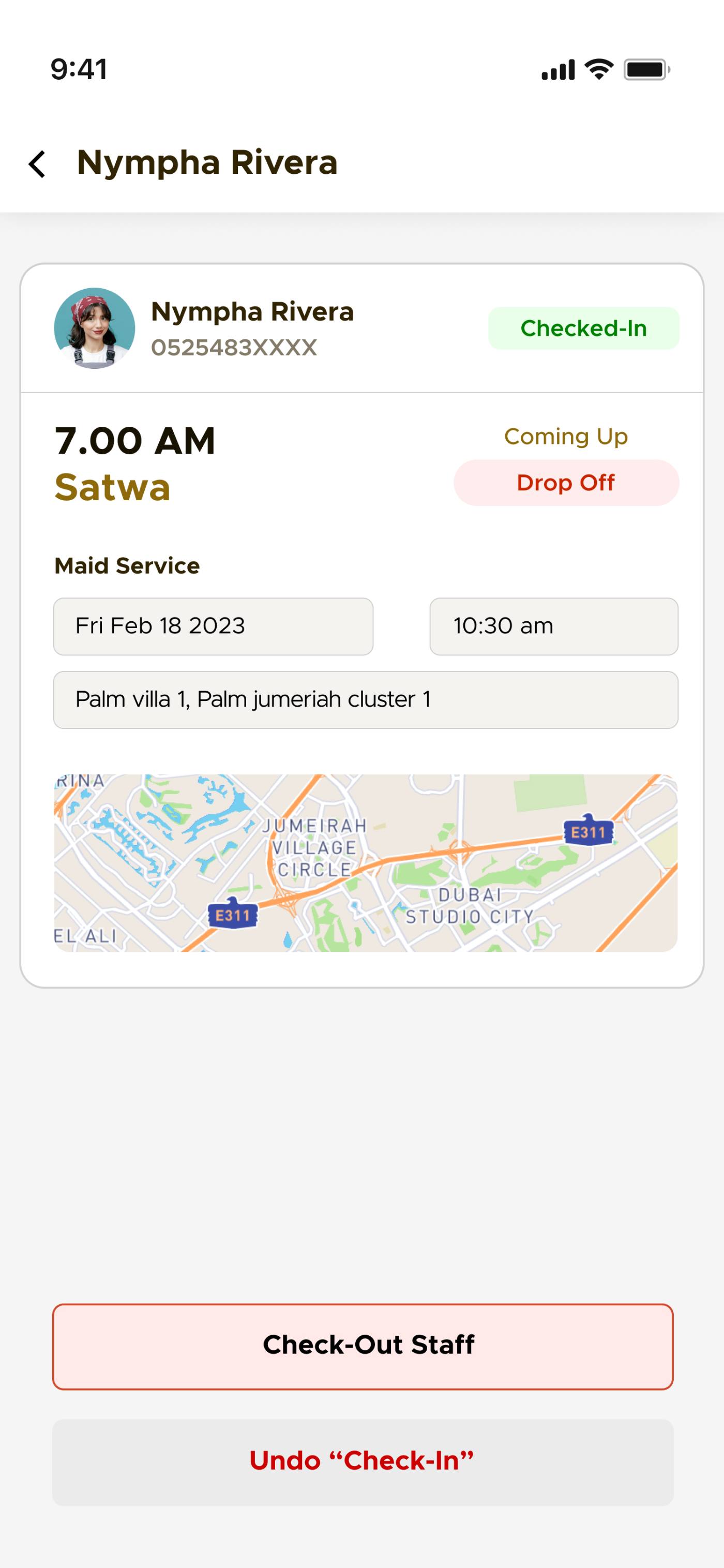
Tapping a staff member opens their detail view — current status (Checked-In), upcoming job with location map, and two bottom actions: Check-Out Staff and Undo "Check-In." This screen was the most debated in design review.
"Coming Up" + "Drop Off" shown prominently above the job details — drivers know what action is coming next without reading anything.
Undo "Check-In" kept as a bottom action — not hidden in settings. Drivers said knowing it was there made them more confident tapping Check-in in the first place.
Early version showed both Check-Out and Undo as equal-weight buttons — usability testing showed drivers mis-tapped Undo when they meant Check-Out. Final version makes Check-Out the clear primary CTA.
A driver's morning, from first tap to final drop-off.
Full day visible instantly — all jobs as ordered cards with times, locations, staff.
Tap "Staffs in my car" → staff modal → big green Check-in. Done in 2 taps.
Live buffer countdown tells driver exactly when to depart for next job.
Tap Drop Off on arrival. Made a mistake? One-tap Undo — no call to dispatch.
End-of-day km input goes into history — managers verify routes and payments.
The hard design problems.
Drivers are in a moving vehicle, managing passengers, watching traffic. A complex UI isn't just bad UX — it's a safety risk.
Every core action reduced to one tap. Every status readable in one glance. Large touch targets throughout. Countdowns visible at card level — no drilling in required. The design's success criterion was: does it work at a red light?
Drivers needed simplicity and speed. Dispatchers needed detailed, accurate status visibility. A single product had to serve both without compromising either.
Designed the driver-facing timeline as the primary interface, with status badges that automatically surface the data dispatchers need as a byproduct — no separate dispatcher dashboard required for core monitoring.
Check-in errors were treated as edge cases — fixed by calling dispatch. This created anxiety and slowed drivers down, since they were afraid to tap the wrong action.
Elevated Undo to a first-class feature visible immediately after every action. Designed the system to treat errors as expected, not exceptional — which paradoxically reduced errors by removing fear of tapping.
Drivers had been managing routes across calls, WhatsApp, and a basic job list for months. Getting them to trust one app meant the app had to visibly do more than all three channels combined.
Embedded Call and WhatsApp quick-contact directly in the staff modal — the app didn't replace other channels by removing them, it replaced them by making them faster inside the timeline. Drivers adopted it because it was strictly better, not because they were forced to switch.
Drivers went from juggling 3 apps to tapping one timeline.
The biggest shift wasn't operational — it was emotional. Drivers reported feeling calmer and more in control. Staff felt less anxious because check-in and drop-off states were visible and correctable.
"I tap one thing and I know the whole day. Before, I was on the phone constantly."
Driver, post-launch feedback session
"The Undo button. That's the most important thing. Now I'm not scared to tap the wrong thing."
Driver, usability testing session
What this project taught me.
Designing for a moving vehicle isn't just "make it mobile-friendly." It requires a complete rethink of interaction model, touch target size, information density, and what "good UX" means when a user has 3 seconds.
Recoverability isn't a nice-to-have — it's what gives users the confidence to act at all. When drivers knew they could undo, they stopped double-checking everything and started trusting the interface.
The most impactful thing the timeline did wasn't the countdown or the Undo button — it was giving drivers and dispatchers the same view of reality. Coordination calls dropped because both sides finally agreed on what was happening.