Maid Companion App
Increase in total work hours tracked — maids logged more consistently after launch
Improvement in completed jobs per maid per month
Increase in app engagement — daily active usage sustained post-launch
Higher stakeholder satisfaction — maids, supervisors, and YellowZap operations all reported improvement
Maids were losing income they had already earned.
Field maids working through YellowZap had no unified way to track their hours, monitor their earnings, or manage their bookings. Work was logged in notebooks. Earnings were disputed. Reviews were scattered across platforms where no one could act on them.
The consequences were financial: missed logging meant missed pay. The consequences were emotional: maids felt uncertain and unseen. The design challenge was to give them a tool that felt personal to them — not just a job management system imposed from above.
“She often asks for a simple way to track her working hours and earnings. She complains about forgetting to record her time, which results in missed pay.”
Empathy map finding, field research sessions
Conducted during actual workdays — not in an office. Observed real work-tracking behaviour in context, not self-reported recall.
Inconsistent tracking (manual logs causing errors), unclear earnings (no visibility into monthly progress), and scattered feedback (reviews lost across apps).
One structured observation day added to 30+ individual interviews — capturing both stated needs and actual behaviour patterns.
Designing for feelings, not just functions.
Most workforce apps are designed around operational efficiency. This one was designed around emotional outcomes — because for a maid, the feeling of financial control isn’t a nice-to-have, it’s the product.
The primary emotional goal. Maids should feel relieved — not stressed — when they open the app. Every data point visible reduces one anxiety. Hours logged: relief. Payment confirmed: relief. Booking accepted: relief.
The secondary emotional outcome. The performance dashboard, rating display, and incentive tracker were all designed to make maids feel proud of their work — not just informed about it. Seeing 4.3 stars next to your name does something numbers alone can’t.
The deepest need. Maids felt powerless over their earnings and schedule. Every design decision — from the salary calculator to the Accept/Decline job flow — was made to give them genuine agency, not the illusion of it.
What maids say, think, feel, and actually do.
Standard user interviews tell you what people say. Empathy mapping tells you where the gaps are between what they say and what they actually feel and do. Those gaps are where the real design opportunities live.
“I just want a simple way to track my hours and see what I’ve earned.” She asks for simplicity but the underlying need is financial transparency — two different design targets.
“Am I earning the right amount? I can’t tell.” She constantly worries about payment accuracy but doesn’t feel empowered to question it — because she has no data to back her up.
Anxious and frustrated by lack of transparency. Relieved when she can finally see a clear view of her earnings. The emotional gap between these two states is the design brief.
Records hours in notebooks or basic phone notes. Checks with supervisors to confirm payments. These workarounds signal that the current system has failed her — and they’re the behaviours we needed to replace.
Five phases. One non-negotiable constraint: design for her, not for ops.
30+ interviews and a full observation day. Empathy mapping across Says, Thinks, Feels, Does.
User personas, goal statements, and pain point hierarchy. Three core problems ranked by emotional and financial impact.
Brainstorming, user flows, and feature prioritisation. The Salary Calculator emerged here as the highest-value unique contribution.
High-fidelity wireframes and visual design. Booking flow, dashboard, performance tracker, and salary calculator all built and iterated.
Usability testing with actual maids. Survey insights and iterative improvements before handoff.
The decisions that turned anxiety into control.
Each pivot came from a specific research finding — not a preference, not a trend.
A simple total earnings figure shown at the end of the month — clean, minimal.
A real-time salary calculator showing current earnings, projected monthly total, and hours-to-incentive target. Research showed that monthly figures produced anxiety (too far away, too abstract). Daily/weekly visibility gave maids the sense of progress that motivated more consistent work.
Job details buried inside a card — tap to expand, then find the accept button.
A dedicated Booking Details screen with full job info (service type, duration, cleaners, payment, location, deadline) and two prominent CTAs — Decline (left, red) and Accept Job (right, yellow). Urgency indicator “Accept job by 3:30 PM” shown prominently. Testing showed that buried actions caused decision paralysis and job misses.
A generic home screen with upcoming jobs and a notification feed — operational, not personal.
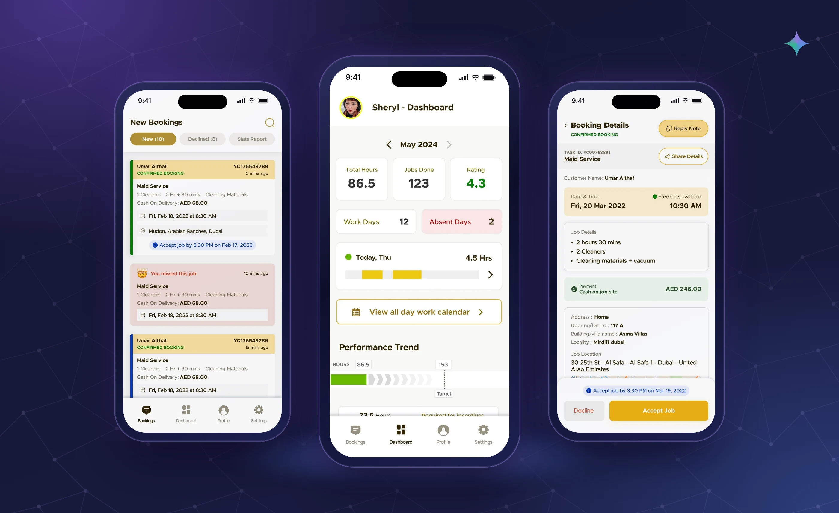
A personalised dashboard (Sheryl — Dashboard) showing Total Hours, Jobs Done, and Rating as the three headline metrics — then Work Days vs Absent Days, today’s hours, and a Performance Trend tracker. The personal name and performance framing made maids feel ownership over their own data, not just visibility into company records.
Missed jobs simply disappeared from the bookings list — no acknowledgement, no context.
A distinct “You missed this job” card state with an emoji, pink background, and timestamp. This decision was uncomfortable to include — nobody wants to show failure — but testing revealed that transparent tracking of misses was what maids most needed to improve. Seeing missed jobs helped them understand patterns and make better decisions about schedule management.
Incentive thresholds communicated via supervisor messaging — no visibility in the app itself.
A visible target line on the Performance Trend chart showing hours required for the next incentive tier. “73.5 Hours — Required for incentives” shown as a persistent callout. Making the target visible turned an abstract manager goal into a personal achievement milestone that maids actually worked toward.
The Salary Calculator — financial clarity as a product feature.
Most workforce apps show what happened. This feature showed what was about to happen — giving maids the ability to project their earnings and plan their schedule around financial goals, not just accept whatever work came in.
Before this feature, maids had no way to answer the question “How much will I earn this month?” Now they could. Enter the hours worked and planned, and the calculator shows projected earnings, current standing against target, and hours needed for the next incentive tier — all in real time.
Three screens. Every design decision has a research reason.
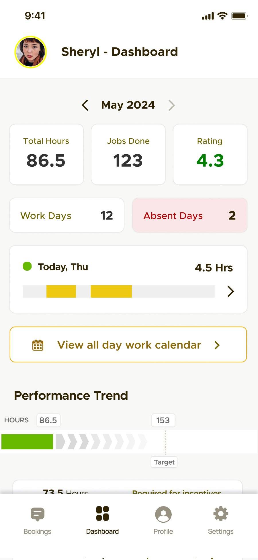
Using the maid’s name (“Sheryl — Dashboard”) makes this feel like her data, not the company’s data about her. Three headline metrics — hours, jobs, rating — show the things maids care about most. Absent Days in pink creates appropriate visibility without shame.
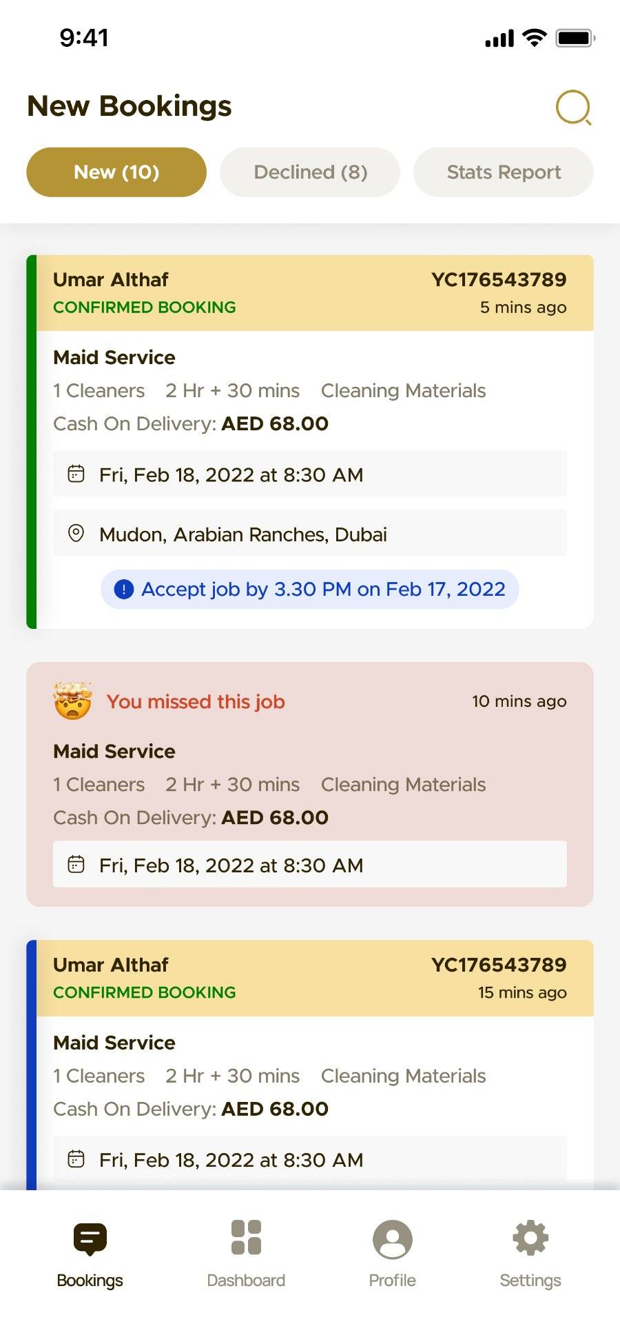
Confirmed bookings (green left border + gold header), missed jobs (pink background + emoji), and pending bookings each have distinct visual signatures. Maids understand their full booking status without reading a single word — colour and shape do the work.
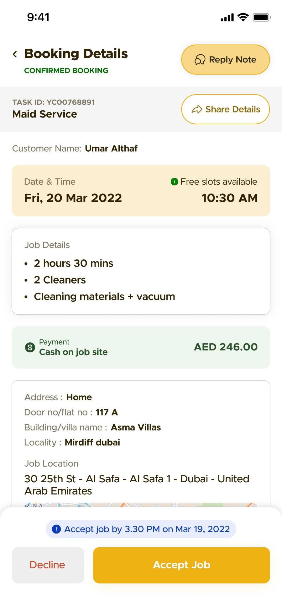
The booking details screen was designed around one question: what does a maid need to know before she says yes or no to a job? The answer was: service type, duration, team size, payment amount, exact location, and how long she has to decide.
One unified app that gave maids visibility, control, and confidence.
The shipped app replaced notebooks, supervisor calls, and scattered platforms with a single tool that handled bookings, earnings tracking, performance monitoring, and schedule management — built around what maids actually needed emotionally, not just operationally.
Every feature was designed to answer one question maids were constantly asking: “How am I doing and what do I get paid?”
- Personalised dashboardHours, jobs, rating, work days, today’s timeline — all personal, all actionable
- Salary calculatorReal-time earnings projection with incentive target tracker — first time many maids had financial clarity
- New Bookings feedConfirmed, missed, and pending jobs clearly distinguished — full status at a glance
- Booking detailsFull job info + accept/decline with deadline — every decision made in one screen
- Performance trendChart with incentive target line — turns abstract goals into visible daily milestones
The business case for this app was simple: maids who feel in control work more consistently, miss fewer jobs, and stay longer.
- Consistent job tracking15% increase in hours tracked — more data, more accurate payments, fewer disputes
- Higher completion rates25.5% improvement in completed jobs — maids making better scheduling decisions
- Retention signal30.1% engagement increase — maids returning to the app daily signals reduced churn risk
- Reduced supervisor loadEarnings visibility reduced payment query calls to supervisors significantly
- Enterprise profile scalingDynamic profiles and visual flyers created a new revenue channel beyond the core app
Enterprise solutions that scaled revenue beyond the core product.
Applying the same design thinking that built the maid app, I identified two enterprise-level features that could generate new revenue for YellowZap while directly benefiting maids — turning the companion app into a platform, not just a tool.
Each maid gets a professional profile page that functions as a trust-building portfolio — visible to customers before booking and shareable by the maid herself.
- Ratings & ReviewsVerified, visible, building credibility over time
- Expertise tagsDeep cleaning, maid service, specialisations clearly signalled
- Service locationsZone-wise coverage so customers know availability upfront
- Professional photosHumanising the service, reducing no-shows
Auto-generated marketing flyers that maids can share directly to WhatsApp, social media, or community groups — turning each maid into a micro-channel for YellowZap customer acquisition.
- Maid’s photo + bioPersonal connection that generic platform listings can’t provide
- Transparent pricingNo hidden costs, building customer trust before first contact
- QR codeLinks directly to the maid’s YellowZap profile and booking page
A maid’s morning — from opening the app to accepting a job.
See total hours, jobs done, rating, and today’s schedule at a glance.
Scan confirmed, missed, and new jobs — all visually distinct, no guessing.
Full booking info — service, pay, location, deadline — in one screen.
One tap. Informed decision. No supervisor call needed.
Salary calculator shows projected monthly total and hours to next incentive.
The hard design problems.
Many maids were not regular smartphone app users. Complex UI patterns caused confusion and abandonment — but the app needed to surface dense information (earnings, bookings, performance) without overwhelming users.
Visual language over text at every opportunity. Colour-coded booking states, progress bars for performance, a dashboard that reads at a glance without scrolling. Reduced reading load to near zero for all core tasks.
Showing missed jobs and absent days risked making the app feel like surveillance — a tool for management to monitor maids rather than a tool that served them.
Framed all negative states in the context of improvement, not judgment. Absent Days in pink (not red). Missed jobs shown with emoji and neutral timestamp, not alarm language. The tone throughout is “here’s your data” not “here’s what you did wrong.”
Maids had used basic apps and notebooks that failed them — hours untracked, earnings disputed, reviews lost. Their starting point was scepticism, not openness.
The salary calculator became the trust-building feature — because it gave maids something no previous tool had: the ability to verify their own earnings independently. When a maid could calculate her pay herself and see it match what she received, the app earned her trust in a way no onboarding flow could.
YellowZap needed operational data — job completion rates, attendance, performance trends. Maids needed personal empowerment. These two needs can produce conflicting designs if not handled carefully.
Designed the maid experience first, then verified that the same data satisfied operational needs as a byproduct. When a maid tracks her own hours for her own financial clarity, she’s simultaneously providing the data the business needs. The maid’s benefit was the primary design goal — the business value was the result.
The numbers after we launched.
Increase in work hours tracked — more consistent logging, fewer missed pay disputes
Improvement in completed jobs per maid per month
Increase in app engagement — daily active usage sustained long after launch
Higher stakeholder satisfaction across maids, supervisors, and YellowZap operations
Enterprise features shipped beyond the core app — dynamic profiles and visual flyers
Payment query calls to supervisors — earnings visibility handled questions the app used to require a human to answer
What this project taught me.
Discovering the gap between what maids said (“I want simple tracking”) and what they felt (“I’m anxious about whether I’m being paid correctly”) changed the entire product direction. The salary calculator didn’t come from a feature request — it came from the empathy map.
The instinct in design is often to hide negative information — missed jobs, absent days — to protect users’ feelings. This project taught me the opposite: users who see their real data make better decisions and feel more respected. Hiding it is patronising, not kind.
The same empathy that produced the salary calculator produced the dynamic profile and visual flyer features. Good product thinking doesn’t stop at the core use case — it finds adjacent opportunities that serve the user and the business simultaneously.