Gamified Coming-Soon Experience
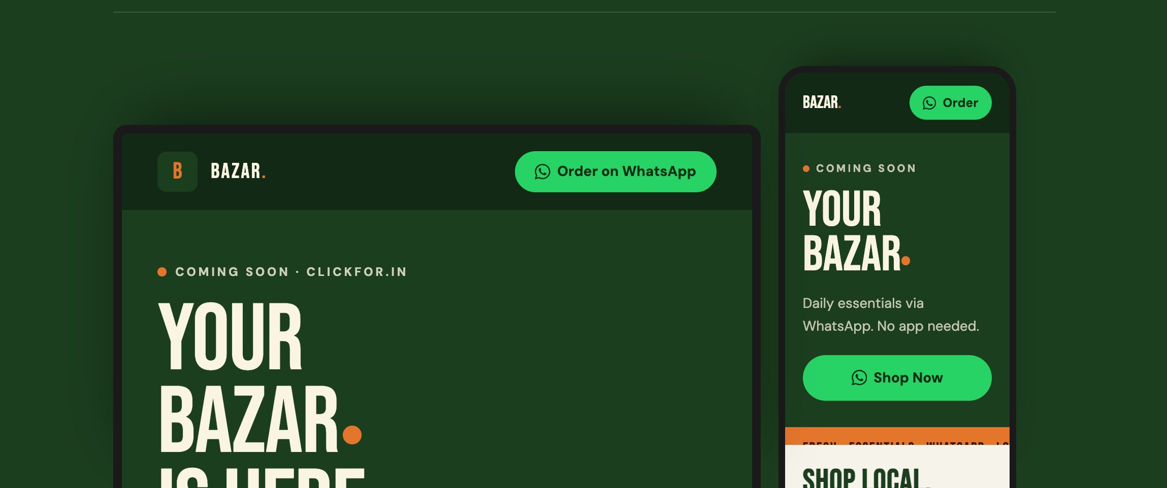
Page. Zero friction between domain and first impression.
Single conversion path. Tap → chat → order.
Apps to download. Pure web, works on any phone.
Days from brief to live. Playful, fast, done.
A domain, no page, and customers clicking through.
clickfor.in Bazar had already bought their domain and started a WhatsApp-based daily essentials business for local neighbourhoods. But anyone clicking the link landed on nothing — an empty domain was worse than having no link at all.
We needed something live before we could share the link with our first customers. Not a full site — just something that shows we’re real and makes them want to message us.
Domain was live but empty. Sharing the link looked unprofessional and broke trust.
Needed a “coming soon” page for a short window, not a full e-commerce site.
Customers are local, neighbourhood-based — they order through WhatsApp chat, not a cart.
Vibrant, encouraging energy — like a market stall, not a corporate grocery chain.
Every choice had a reason.
The brief said playful and vibrant. The design pulls from a physical market aesthetic — awning stripes, earth tones, a bouncing dot in the logo — rather than generic SaaS clean.
Green signals freshness and trust. The orange dot from the clickfor.in logo anchors every headline. Together they read “fresh market” not “tech startup”.
One CTA, one outcome: open a WhatsApp chat. No sign-up form, no email capture, no cart. The audience already lives in WhatsApp — meet them there.
Rather than a plain hero, I designed a grocery-item match game beside the headline. It makes people pause, play, and smile — a coming-soon page that feels like something, not nothing.
Unbounded’s wide, bold caps give headlines the market-crier energy. Figtree is warm and readable for the supporting copy — nothing feels clinical.
One page. Two layers. Everything it needed.
A single-page landing experience designed to be live in days, play well on any phone, and turn clicks into WhatsApp chats.
Logo mark, colour palette, typographic system, and a visual language rooted in the local market. The orange dot becomes the recurring motif — in headlines, in CTAs, in the animated logo mark.
Sticky nav with floating WhatsApp button, animated headline with the logo’s bouncing dot, marquee ticker, an in-page match game, about section, and a phone/contact block.
Every interaction path leads to the same place — a WhatsApp chat. Floating button, hero CTA, contact section all route to the same number. Frictionless for a local audience.
Designed and built as a single HTML file — no framework, no CMS, no dependencies beyond web fonts. Deployed to Vercel in minutes. Light, fast, maintainable.
The details that make it work.
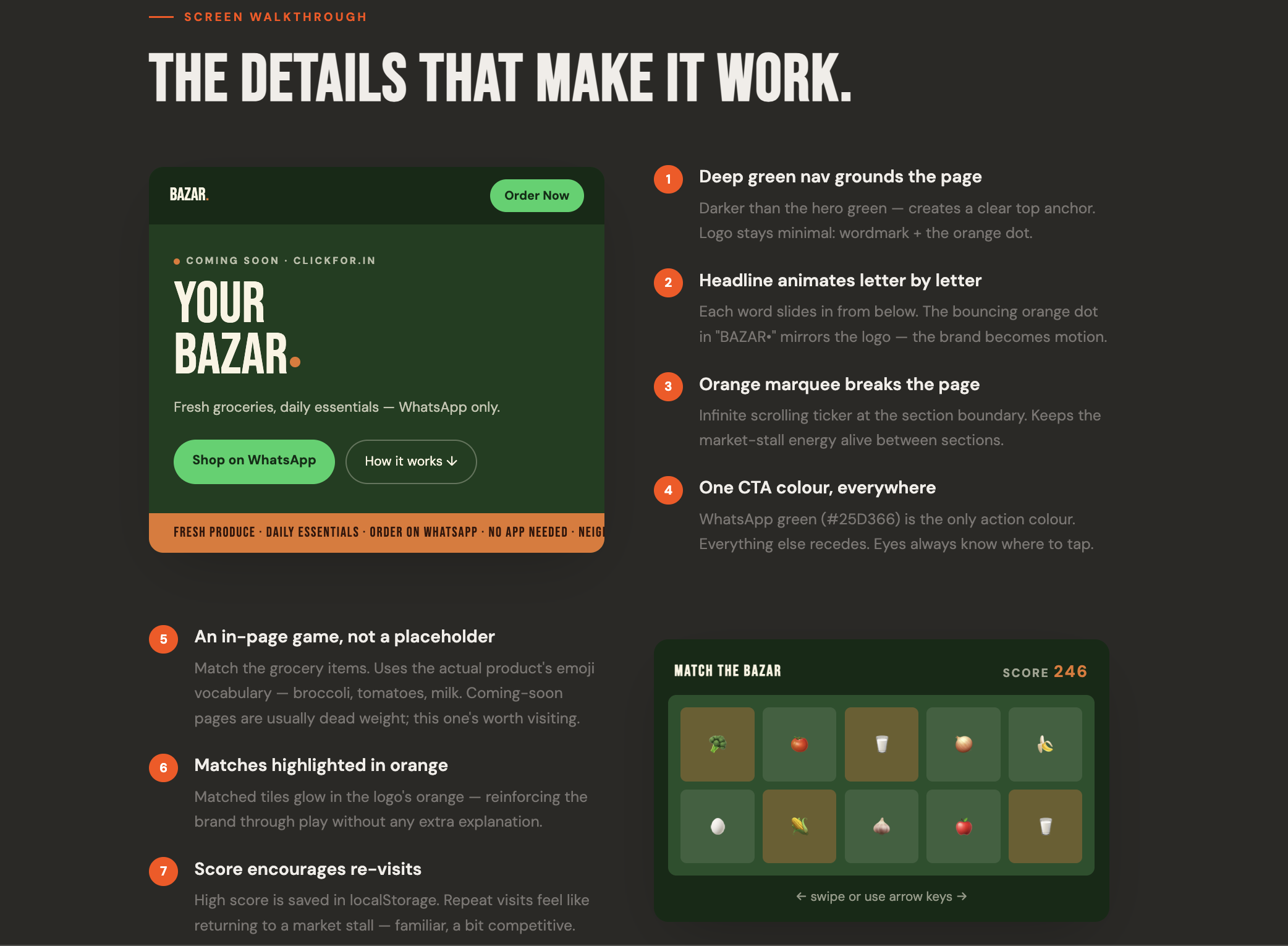
Darker than the hero green — creates a clear top anchor. Logo stays minimal: wordmark + the orange dot.
Each word slides in from below. The bouncing orange dot in “BAZAR•” mirrors the logo — the brand becomes motion.
Infinite scrolling ticker at the section boundary. Keeps the market-stall energy alive between sections.
WhatsApp green (#25D366) is the only action colour. Everything else recedes. Eyes always know where to tap.
Match the grocery items. Uses the actual product’s emoji vocabulary — broccoli, tomatoes, milk. Coming-soon pages are usually dead weight; this one’s worth visiting.
Matched tiles glow in the logo’s orange — reinforcing the brand through play without any extra explanation.
High score is saved in localStorage. Repeat visits feel like returning to a market stall — familiar, a bit competitive.
What made this interesting.
No existing brand, no moodboard — just the words “playful, vibrant, encouraging.” Had to define the visual world from scratch.
Domain was already live and pointing nowhere. The client was actively sharing it with potential customers. Every day without a page was a lost impression.
Local neighbourhood customers browse on phones, not desktops. The design had to feel native on a phone screen without a dedicated app.
Unconventional for a landing page — most want email capture or account sign-up. Here, the whole business model is WhatsApp chat. Designing for one exit was a constraint and a clarity.
The game panel idea came late. Fitting it alongside a large hero headline without the page feeling cluttered required careful proportioning.
Built as a single HTML file for Vercel deployment. Canvas game, CSS animations, accessible markup — all without reaching for a library.
A placeholder that earned its keep.
- →Domain went from empty to a polished first impression in 7 days
- →WhatsApp CTA immediately functional — first customers started chatting within 24 hours of launch
- →Match game created organic sharing among the initial customer group — “have you tried the game?”
- →Single HTML file: sub-1s load on a mid-range Android over 4G
- →Brand identity extended to WhatsApp business profile, stickers, and product catalogue thumbnails
- →Page designed to swap in a full catalogue when the business is ready
Days from brief to live site
HTML file. No build step, no framework.
First WhatsApp orders after launch
Apps to download. Pure web.
What I’d carry forward.
A small brief with a clear constraint is often cleaner to design than an open-ended one. This one was fun.
The single CTA direction made every decision easier. One exit: WhatsApp. That clarity pushed the design toward an experience that was actually confident — no hedging, no catch-all.
The game was the most memorable detail. If I revisited this, I’d make the game a bigger hero — let it take up more of the viewport, make the score more visible, surface a leaderboard to encourage sharing.
No framework was the right call. Vercel + plain HTML means the client can share the file with a developer in six months and they’ll understand exactly what’s happening.
They don’t have to be a blank waiting room. This one was playful, brand-true, and functional on day one. A coming-soon page is still a first impression — design it like one.